Lower Your Expectations
Wow, I had low expectations given the $199 price, but the Amazon Kindle Fire still managed to disappoint me.
Pros:
- $199
Cons:
Hardware
- Backlight bleeding all around the edge of the screen.
- Power button is badly placed and I’ve accidentally shut off the Fire several times when holding it.
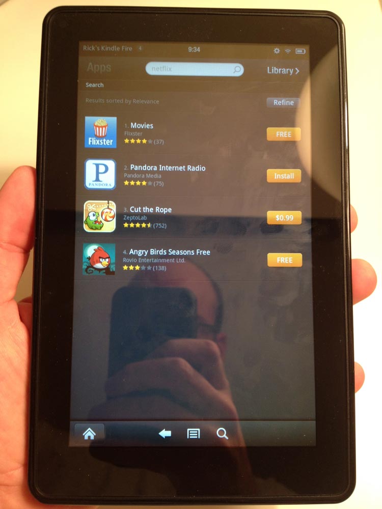
- Super-reflective screen. Much more reflective and finger-print-showing than other tablets. (See picture)
- Poor battery life, at least compared to the iPad.
- 6 GB of usable space so you can’t load this up with movies. I guess Amazon wants this to be more of a streaming device. But you’re left with little space if you need to load this up for travel away from WiFi.
- Surprisingly heavy. I suppose this is because I’m used to holding Amazon’s similar sized e-ink tablets. But when you hold the Fire, the weight is the first thing you’ll notice.
- No mic, no cameras, no bluetooth, no SD card slot, no gyroscope (for better gaming control).
- No hardware Home button or volume buttons. From some pages, it takes a few software button presses to get to the volume controls.
Software
- Carousel interface for all your items is a terrible idea, made even worse by the fact that once you launch anything it goes in the Carousel and can not be removed. So you end up with a really long carousel with stuff you don’t want.
- Inconsistent UI. For example, when you reach the end of a scroll page, some pages bounce while other pages brighten on the edge.
- Slow UI response in many places such as pinch-to-zoom.
- Apps crash. On each of three Kindle Fire units we tested, Angry Birds crashed on first launch. It worked after that. The browser had several crashes.
- Flash works, but Flash videos are jerky to the point of being unwatchable.
- Slow browser. This is especially disappointing given that Amazon promoted the speed of it’s Silk browser.
- AppStore allows you to buy apps that don’t work properly on the Kindle Fire.
- AppStore search doesn’t work. Searching for “Netflix” resulted in four apps, none of which were the Netflix app. (See picture)
- AppStore has very few apps compared to other Android devices with Google Market.
- The magazines are just scans of the magazine. These aren’t nice PDFs with embedded fonts. So when you zoom, the text gets fuzzier. The aspect ratio of 16×9 doesn’t fit magazines well. There is empty space at the top and bottom when viewing the full page.
- There is one odd thing I haven’t figured out yet. When scrolling a web page, it looks as if the page tilts in the direction you are scrolling. I haven’t been able to capture this on camera. I can’t tell if this is a UI decision or a weird screen drawing or refresh issue.
Alternatives
I’m not just being an Apple fanboy here. While both the iPod Touch are iPad are far superior to the Fire, so are the Samsung Android devices which are faster and have a better UI. And if you want to just read, the e-ink Kindles are great. The Kindle Fire is just not a fully developed product.


I agree completely with everything you pointed out. Amazon obviously geared this as a streaming device for their store, which is fine. The problem is that makes this somewhat of a closed device, for which everyone slams Apple. The next problem is that since this is somewhat of a closed device you would expect it to be very tweaked and seamless but that is not that case. This is simply a closed device running an OS that boasts being open. All of the aspects that make the OS remotely appealing are gone.